What's inside
As an Amazon Associate I earn from qualifying purchases. This post may contain affiliate links at no extra cost to you.
A white-pigmented oil finish can lighten wood without hiding its grain, but the result depends more on the species and preparation than on the oil itself. On pale, evenly colored wood, a small amount of white pigment can soften yellowing and keep the surface looking natural. On darker or strongly figured wood, it may look cloudy, streaky, or simply like a thin coat of paint.
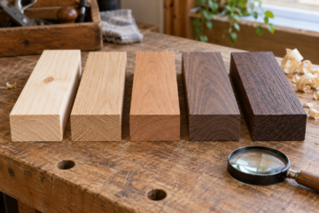
For a restrained whitewashed effect, start with maple, birch, ash, or oak. Test the actual wood and finish together: boards from the same species can vary, and sanding grit, application rate, and excess removal all change the result.
As an Amazon Associate we earn from qualifying purchases at no extra cost to you.

Our Top Picks
 Sunnyside Corporation 872G1S Boiled Linseed OilGallon4.15 x 6.64 x 10.32 inches8.25 poundsCheck on Amazon
What to look for in the wood
The easiest woods to finish subtly are light-colored, fine- or moderately grained, and reasonably consistent from board to board. White pigment settles in pores and sanding marks, so open-grained woods show more variation. That can be attractive, especially on oak, but it is not the most reliable route to a quiet, even look.
Also consider the wood’s natural color. A white-pigmented oil can mute warm tones; it will not turn amber heartwood into uniform white. Sapwood and heartwood may respond differently, and patches of mineral streaking or figure will remain visible. If you need a very even, pale surface, select boards for color before finishing rather than expecting pigment to conceal differences.
Species compared
| Species | Typical result | Best use | Main drawback |
|---|---|---|---|
| Hard maple | Pale, fairly quiet, clean-looking | Furniture, cabinets, small panels | Can blotch or show lap marks if application is uneven |
| Birch | Light with moderate grain variation | Cabinet parts and budget projects | Color can vary; less uniform than selected maple |
| White oak | Visible grain with pale pore lines | Tables, flooring, larger furniture | Open pores make the white effect more pronounced |
| Ash | Strong, open grain; bright overall | Projects where grain should remain prominent | Can look striped or chalky with too much pigment |
| Beech | Fine grain and light color | Small furniture and work surfaces | Pinkish or tan cast may remain under the finish |
| Red oak | Strong grain with warmer cast | Rustic or distinctly grained pieces | White pigment can emphasize pores without removing the warmth |
Best choices for a subtle finish
Hard maple is a strong choice when you want a pale surface with little visual interruption. Its close grain does not hold as much pigment in the pores as oak, so the finish tends to read as a soft veil rather than a white-filled grain pattern. The trade-off is that maple shows uneven application and sanding scratches clearly. Keep the surface preparation consistent, and work in manageable sections.
Birch can deliver a similar light appearance at a lower cost, particularly for painted-grade or secondary furniture parts. It is not always as uniform: color shifts and small patches can become more noticeable after finishing. If appearance matters, inspect the boards under bright, neutral light and make a sample on an offcut. The cheaper option is fine for interiors where a little variation is acceptable.
White oak is the better choice if you want a visible grain pattern. Pigment collects in its open pores, making the grain stand out against the lighter surface. That is a feature, not a defect, but a heavy application can produce an obvious white-filled effect. Choose oak with a consistent cut and grain if you want a restrained result. Red oak can work too, but its warmer cast is harder to disguise with a transparent oil finish.
Species to approach carefully
Ash has dramatic pores and can look striking, but it is easy to overdo the pigment. Beech is relatively fine-grained, yet its natural warm or pinkish tone may still show through. Dark woods such as walnut, cherry, and mahogany are poor choices if the aim is a naturally pale surface: white oil may turn them gray, cloudy, or contrasty rather than convincingly light.
For those darker species, consider whether a tinted or opaque finish would better match the goal. A white-pigmented oil is most useful when you want the wood to remain recognizably wood, not when you need to erase its natural color.
Preparation and application matter
Sand the whole surface evenly. For many furniture projects, finish with 120- to 180-grit abrasive, following the finish maker’s instructions; sanding much finer can reduce absorption and make the effect weaker or less even. On open-pored oak or ash, sanding dust can lodge in the grain and combine with pigment into pale streaks. Vacuum thoroughly and use a clean, lint-free cloth before coating.
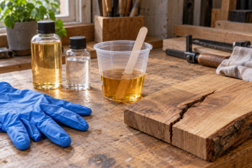
Test at least a small offcut through the full process, including the final coat. Apply a thin, even layer with a white finishing pad or cloth, then wipe off excess as directed. Do not leave wet pools at joints, edges, or end grain. Uneven wiping can create dark overlap bands or bright patches, while excess pigment can dry as a chalky film. If the finish calls for a second coat, use it to build protection, not to correct a poorly prepared first coat.
Use a white-pigmented hardwax oil when you want a low-build, natural-feeling surface and are comfortable with its maintenance needs. For application, a white nonwoven finishing pad helps spread a thin coat without leaving brush marks. Follow the product label: coverage, drying time, and whether a second coat is needed vary by formulation.
Choosing wood before you buy
For the least fussy pale look, choose straight-grained hard maple and accept that board selection and careful wiping still matter. Pick birch when price is more important than perfect color matching. Choose white oak when you want pale wood with grain that remains obvious. Ash is a good option for a bolder striped pattern, not for an almost invisible whitewash.
Whatever the species, buy or reserve a spare offcut for testing. A finish that looks subtle on a product sample may read much whiter on your wood, especially in deep pores or under bright lighting. One test board can prevent the most common disappointment: discovering after the whole piece is coated that the desired effect was “barely lighter,” but the result is chalky or high-contrast.
0 Comments