What's inside
As an Amazon Associate I earn from qualifying purchases. This post may contain affiliate links at no extra cost to you.
A transparent red finish shows the wood beneath it, so species choice matters as much as stain choice. The same red dye can look warm and even on cherry, muddy on oak, or blotchy on maple. For furniture and interior trim, cherry is usually the easiest route to a rich, natural red. Maple can give a brighter, cleaner look with more preparation; alder is a lower-cost alternative when its softer grain and blotching risk suit the project.
As an Amazon Associate we earn from qualifying purchases at no extra cost to you.


Our Top Picks
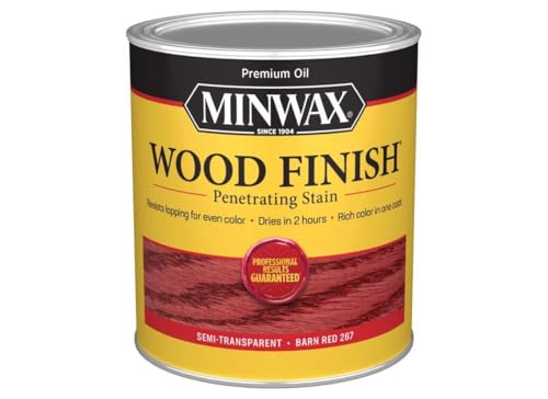 Minwax 701094444 Penetrating Wood Stain Wood Finish Semi-Transparent4.25 L x 4.25 W x 4.89 H4.25 x 4.25 x 4.89 inches2.4 poundsCheck on Amazon
 1/2 pt Minwax 13407 Clear Pre-Stain Wood Conditioner1/2 Pint3 x 3.25 x 3 inches0 PoundsCheck on Amazon


What “transparent red” means
A transparent finish lets the grain remain visible. That can mean a tinted clear coat, a dye beneath clear finish, or a pigmented stain that colors the surface while leaving some grain visible. These methods do not behave alike. Dye tends to preserve grain detail and color evenly, but can emphasize uneven absorption. Pigmented stain can add depth, though it may collect in open pores and obscure fine grain.
For a vivid red that still looks like wood, use a red dye or a lightly tinted finish rather than a thick coat of opaque pigment. Test the complete schedule—color, sealer, and topcoat—on offcuts from the actual boards. A clear finish often deepens and warms red, sometimes more than expected.
How common species compare
| Species | Typical red result | Preparation and trade-offs | Relative cost |
|---|---|---|---|
| Cherry | Warm, natural red-brown; grain stays prominent | Usually colors evenly. Darkens with light exposure, so adjacent pieces can change at different rates. | Medium to high |
| Maple | Bright, clean red with subtle grain | Can blotch, especially with liquid stain. Dye and careful sample testing help; figure may take color unevenly. | Medium |
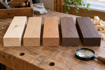
| Alder | Warm red, often close to cherry in color | Soft and easy to work, but blotching is common. Grain is less distinctive than cherry. | Low to medium |
| Red oak | Strong red with bold, open grain | Open pores make the grain contrast dramatic; pigment can lodge in pores and look darker there. | Low to medium |
| Birch | Light, fairly uniform red when dyed well | Prone to patchiness with many stains. Test carefully; a washcoat can reduce uneven absorption but also reduce color depth. | Low to medium |
Best choices by project
Cherry is the safest choice if you want red that looks like it belongs in the wood, rather than sitting on top of it. Its fine, closed grain accepts dye well, and the natural brown-red color gives a transparent finish depth. It is not immune to color variation: sapwood is much lighter than heartwood, and boards exposed to light for different lengths of time can diverge. Buy enough lumber from one batch and arrange the boards before finishing.
Choose maple for a brighter, more even-looking surface if you are willing to test and prepare carefully. Hard maple has subtle grain that can make red appear clean and vivid. The downside is blotching from uneven absorption. Sanding finer is not a reliable cure; an overly polished surface can instead prevent color from taking evenly. A dye schedule and sample boards are better controls than simply sanding to an unusually high grit.
Alder makes sense when price matters and a warm, fairly plain appearance is acceptable. It is commonly used for stained furniture and cabinetry, but it can develop dark patches. A test with the exact dye and sealer is essential, especially on broad panels. Red oak is a good choice when you want bold grain, not when you want a smooth, quiet red. Its open pores create a more graphic result.
Prepare and apply the color
Start with flat, well-sanded wood. Remove machining marks, glue squeeze-out, and scratches; red color tends to make them more visible. Sand most furniture surfaces through 150 or 180 grit, following the finish maker’s instructions. Vacuum thoroughly, then inspect under raking light. Do not use a damp tack cloth unless the finishing system allows it: raising the grain can change how the color lays down.
For maple, alder, or birch, consider a compatible washcoat or conditioner only after testing. These products slow absorption and may reduce blotching, but they can also make the red paler or less transparent. A water-based dye may raise grain; apply a light coat of water first, let it dry, then sand raised fibers lightly before dyeing if the product instructions permit.
Mix enough color for the whole project at once, and record the proportions. Apply evenly, working in manageable sections and keeping a wet edge. If using a stain, wipe excess on schedule rather than letting one area sit longer. Let the color dry fully before sealing. A thin clear sealer helps prevent the topcoat from dragging dye or pigment; test compatibility, since some solvents can shift color.
Choose materials and test the finish
For a transparent, grain-forward result, compare red wood dyes with pigmented stains. Dyes are a strong starting point on cherry and maple; stain may be preferable on oak if you want color in the pores. If blotching is a concern, a pre-stain wood conditioner can be worth testing, but it is not a guaranteed fix.
Make samples from offcuts at least several inches wide. Sand them exactly as you will the project, apply the full finish, and label each recipe. View them in the room’s daylight and evening light. A red that looks balanced under a shop lamp may turn orange or purple under household LEDs. Test the clear topcoat too: water-based finishes usually keep the color lighter, while oil-based finishes add warmth and ambering.
Common failures to avoid
The most frequent disappointment is choosing by a stain label instead of testing on the actual species. “Cherry red” on a can does not predict the result on maple or oak. Other common problems are uneven sanding, glue spots that repel color, and applying a second coat before the first has dried. If a sample looks too dark, do not assume the project can be fixed by sanding after staining; color can penetrate below the surface, and sanding may create pale patches.
When budget is tight, red oak or alder can be perfectly serviceable. Spend the savings on offcuts and testing rather than premium additives. Choose cherry when its natural warmth and grain justify the extra cost, maple when you want a lighter, cleaner look and can control blotching, and oak when visible open grain is part of the design.

0 Comments